DEFCOM, Toronto
Defcom is a Toronto based cybersecurity provider that automates complex compliance and threat detection to deliver **simple, smart, and reliable** protection for modern organizations.
00

problem
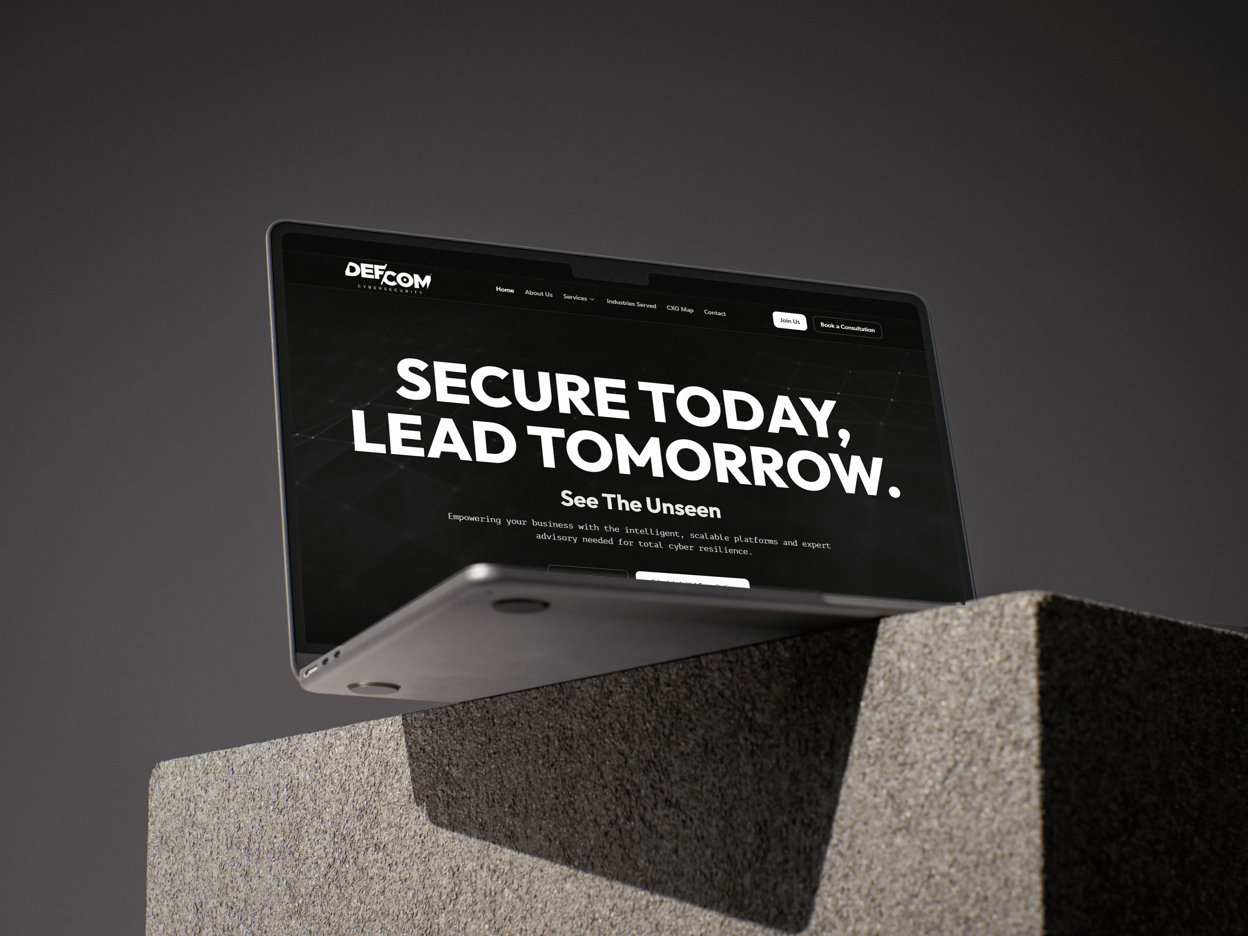
Breaking Through the Noise of Fear Defcom approached us with a distinct challenge: The cybersecurity market is visually saturated with "FUD" (Fear, Uncertainty, and Doubt). Competitors rely heavily on cliché imagery, such as hooded hackers, binary rain, and aggressive red padlocks, creating a chaotic visual landscape that overwhelms decision-makers. Defcom’s technology, specifically their CXO MAP platform, is built on the premise of simplifying complexity and providing clarity. They needed a brand identity that would decouple them from the commodity "IT fix-it" crowd and position them as a high-level strategic partner for C-Suite executives. The goal was to visualize their ability to "See The Unseen" without resorting to fear tactics, ensuring the brand felt approachable yet authoritative to non-technical board members..
solution
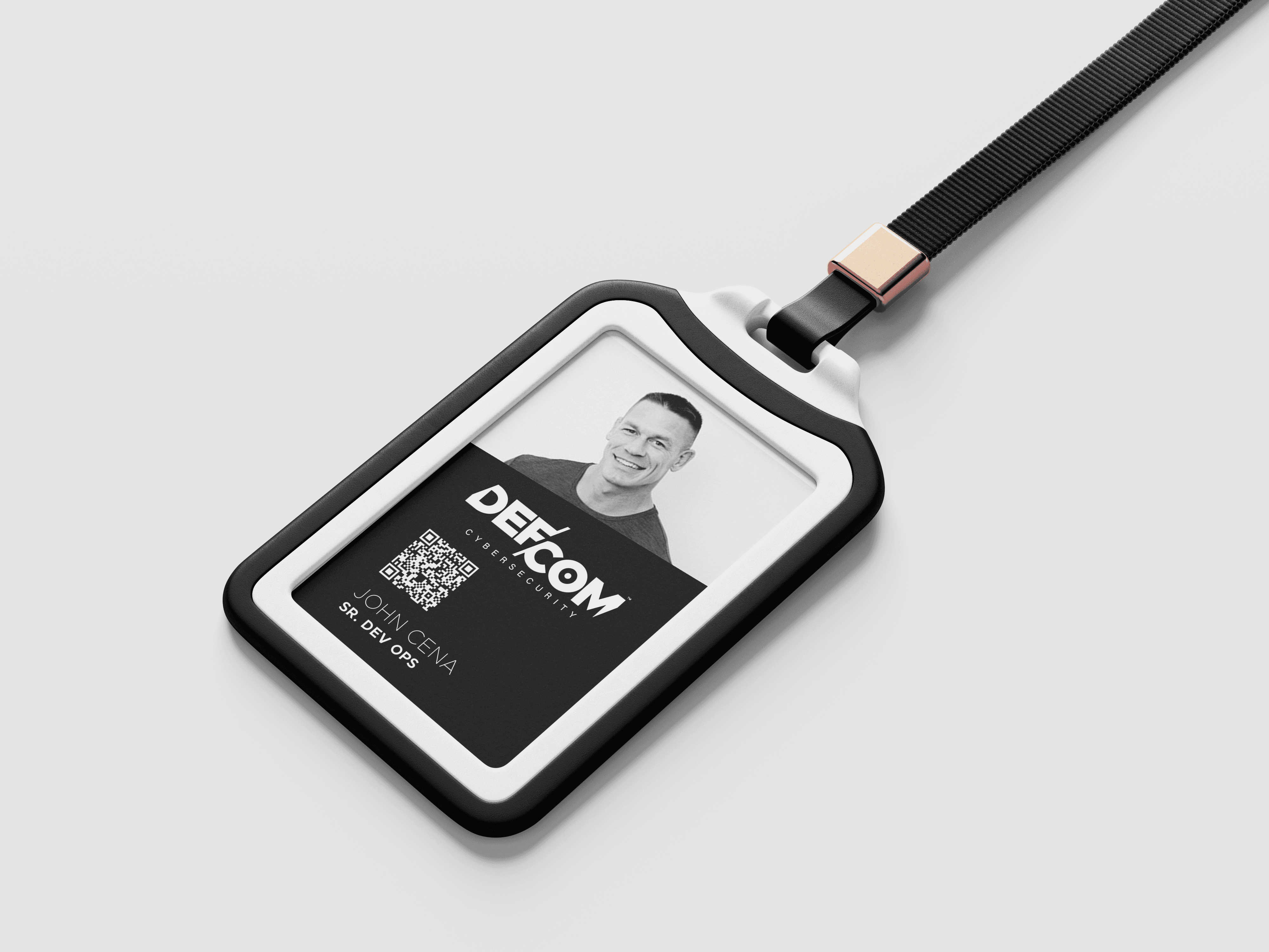
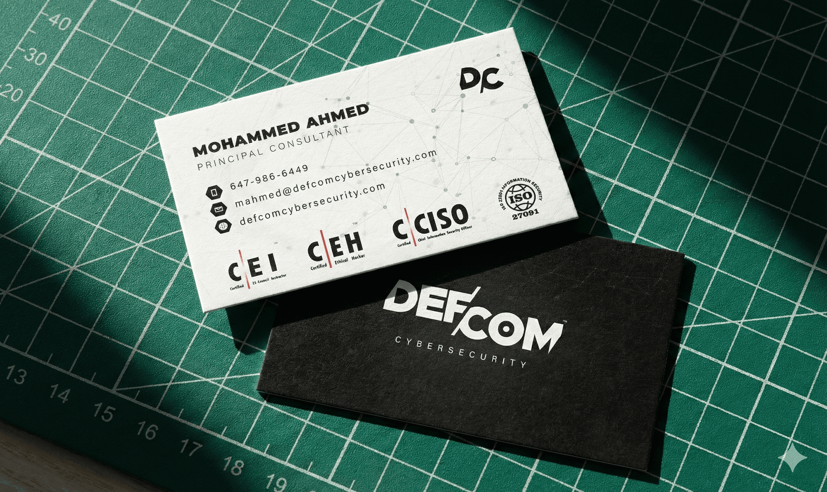
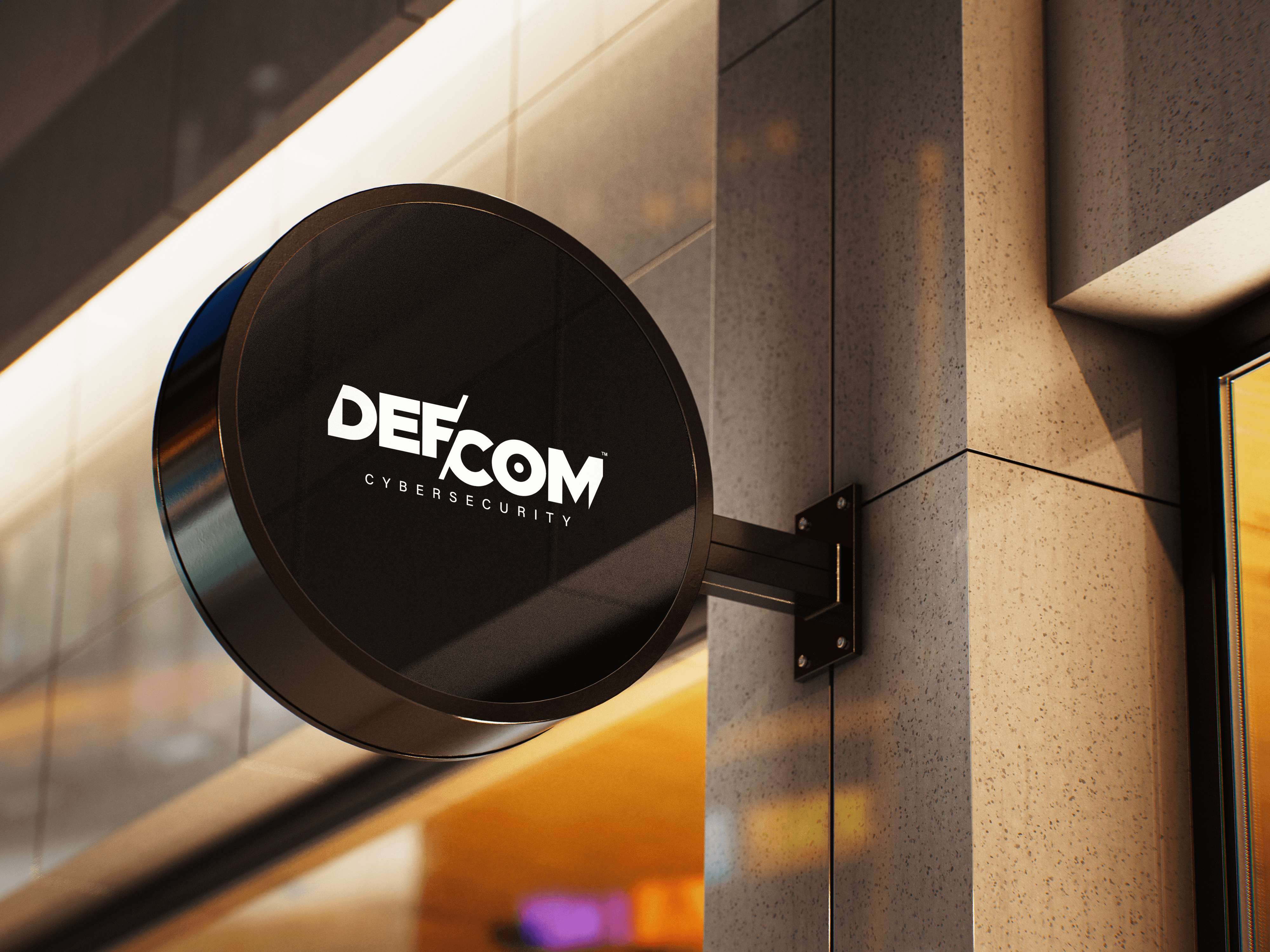
Visualizing Control through Radical Clarity We responded by engineering a visual identity system anchored in Defcom’s core philosophy: "Simple, Smart, Reliable." Moving away from the dark, cluttered aesthetics of the industry, we developed a "Clean-Tech" interface that acts as a calming anchor in a turbulent sector. Simple: We utilized a structured grid system and generous negative space to reduce cognitive load. This visually proves that Defcom simplifies the complex world of compliance and auditing. Smart: The typography and layout were treated with an architectural precision, mimicking the data-driven insights of their AI tools. We replaced generic stock photography with abstract, purposeful visuals that suggest illumination and visibility. This effectively translates the "See The Unseen" concept into a tangible look. Reliable: By creating a polished, highly responsive web experience, we established subconscious trust. The stability of the design signals the stability of their security infrastructure.
Founded with a vision to "Secure Today, Lead Tomorrow," Defcom emerged to challenge the status quo of the cybersecurity industry. Recognizing that traditional, manual approaches to security and compliance were no longer sufficient against modern adversaries, the team set out to transform how organizations protect their digital assets. They sought to eliminate the "blind spots" that plague decision-makers, operating under the mantra: "See The Unseen."

Defcom’s journey is defined by a relentless pursuit of efficiency and intelligence. The founders identified that compliance was often a painful, static check-box exercise rather than a dynamic defense mechanism. In response, they developed CXO MAP, a groundbreaking platform designed to streamline the arduous audit process and provide real-time visibility into an organization's security posture. By combining this automation with a world-class, 24/7 Cyber-SOC, they bridged the gap between complex regulatory requirements and practical, day-to-day threat defense.
Since its inception, Defcom has evolved into a trusted guardian for businesses across sectors like finance, healthcare, and government. By prioritizing intelligent automation and deep expertise, the company has successfully empowered its clients to navigate the storm of AI-driven threats and regulatory demands with confidence. Today, Defcom stands as a beacon of resilience, helping organizations not just survive the digital age, but thrive within it by ensuring their foundations are secure, compliant, and future-proof.
year
2025
timeframe
20 Days
tools
Adobe Creative Suite, Figma, WordPress
category
Branding and Identity
01
02
03
04
05
06
see also


