Gothenburg Museum of Art (Redesigned)
This visual identity redesign reimagines the Gothenburg Museum of Art as a contemporary cultural monolith. Anchored by a geometric abstraction of the museum’s iconic silhouette and a stark Black and White color palette, the system relies on high contrast to frame the classical collection. Through the use of bold, cinematic typography overlaid on historical masterpieces, the branding creates a dynamic tension between the past and the present, ensuring the museum commands attention across everything from building banners to mobile screens
00

problem
The Gothenburg Museum of Art houses one of Northern Europe’s finest collections, yet its visual identity struggled to compete in the digital age. The museum is physically imposing a monumental stone structure at the top of Götaplatsen. However, the previous branding felt disconnected from modern culture, often viewed as too traditional or quiet. The brief was to create a visual identity that possessed the same weight and authority as the architecture but with a contemporary edge that would appeal to a younger, design-savvy audience without overshadowing the art itself.
solution
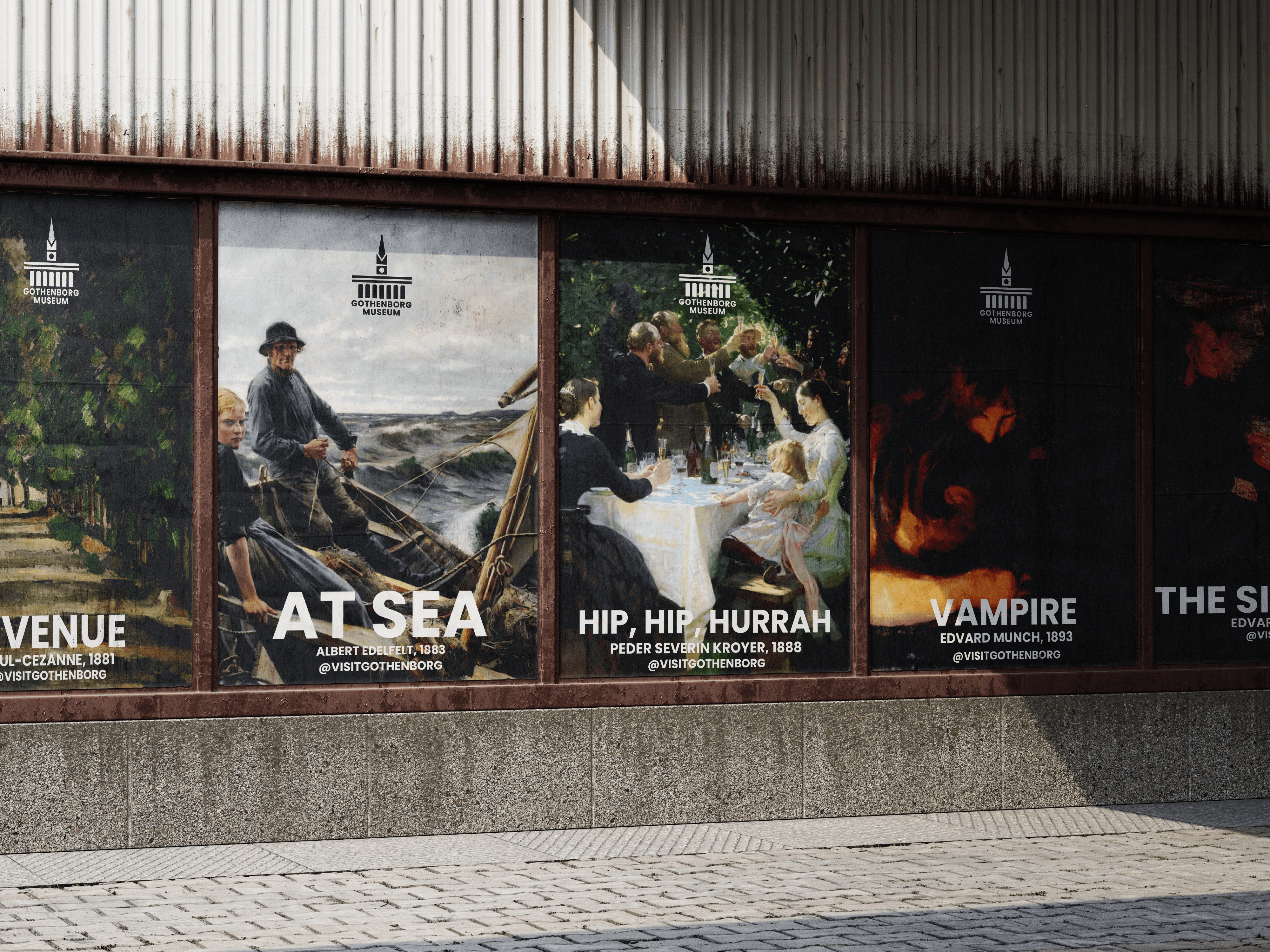
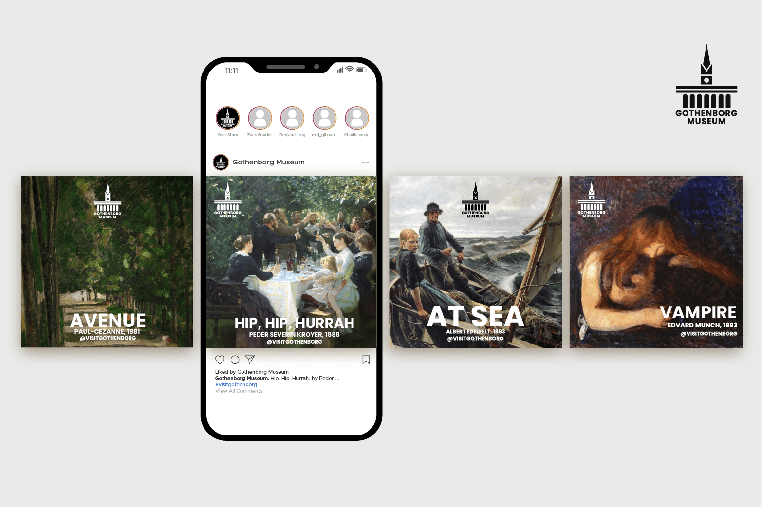
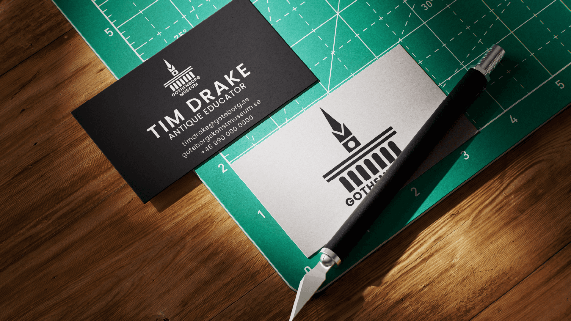
We developed a brand identity anchored in "Stark Authority." Instead of competing with the colors of the oil paintings, we stripped the brand palette down to a rigorous Black and White. This creates a neutral, high-contrast stage where the art becomes the sole source of color. The Icon: We distilled the museum’s famous silhouette (the arches and the tower) into a flat, geometric icon. It functions as a stamp of approval, legible even at small scales on visitor badges or social media avatars. Typography: We abandoned traditional serif museum fonts in favor of a bold, all-caps Sans-Serif. As seen on the street posters, the typography is heavy enough to stand directly over complex artwork without getting lost. The "Dark Mode" Aesthetic We utilized deep black backgrounds for building banners and digital displays. This mimics the experience of a darkened gallery room, where the spotlight is focused entirely on the masterpiece. The result is a brand that feels confident, industrial, and undeniably Nordic.
WHY THE ARTWORK ITSELF?
In a busy urban environment, a museum poster competes with high-contrast fashion ads, movie releases, and digital noise. A polite image of a painting with small text gets lost. By blowing up Hip, Hip, Hurrah! or Vampire to billboard scale and stamping them with bold, white text, I borrowed the visual language of blockbuster cinema. This approach commands the same attention as a film premiere, signaling to the passerby that this exhibition is an event, not just a display.
This visual identity redesign reimagines the Gothenburg Museum of Art as a contemporary cultural monolith. Anchored by a geometric abstraction of the museum’s iconic silhouette and a stark Black and White color palette, the system relies on high contrast to frame the classical collection. Through the use of bold, cinematic typography overlaid on historical masterpieces, the branding creates a dynamic tension between the past and the present, ensuring the museum commands attention across everything from building banners to mobile screens.
year
2023
timeframe
14 Days
tools
Adobe Creative Suite
category
Branding and Identity
01

02

03
04
see also


