Exploring Nepal, Magazine
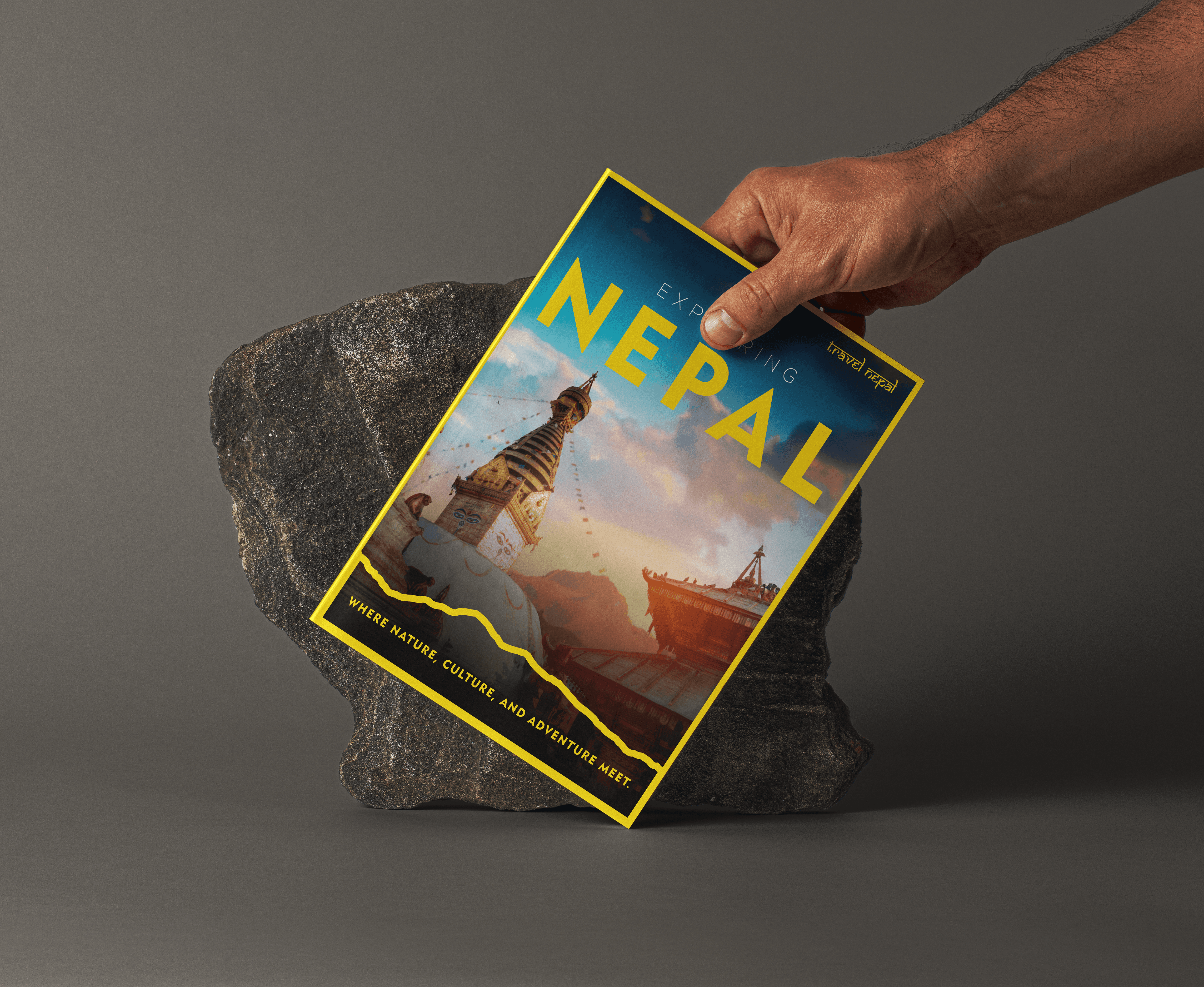
Anchored by a warm "Marigold" color palette and a rigid architectural grid, the layout captures the spiritual intensity of festivals like Dashain and the majestic scale of peaks like Mount Everest and Machhapuchhre. The design utilizes a "portal" framing motif to treat every page as a window into the country's hidden gems, creating a tactile and immersive travel companion that invites the reader to wonder.
00

problem
Transcending the "Just Everest" Narrative Nepal is often reduced to a single dimension in the global tourism market: mountaineering and Mount Everest. While the Himalayas are the crown jewel, the client needed to showcase the country's full, vibrant spectrum, its humidity-soaked jungles, ancient spiritual architecture, and rich biodiversity. The challenge was to create a magazine design that didn't just look like a hiking brochure but felt like a cultural immersion. We needed to visually weave together the adrenaline of adventure with the serenity of spirituality, appealing to a traveler seeking not just a summit, but a "soulful escape
solution
A Palette of Spirit and Earth We developed a visual language we call "Organic Vibrancy." Deviating from the cool blues and whites typically used in alpine tourism design, we drenched the layout in the colors of Nepal’s soul: Marigold Yellow and Crimson Red. Warmth: We utilized a dominant yellow border and background strategy to mimic the warmth of the sun on the peaks and the spiritual robes of the monks. This creates an immediate feeling of welcome and optimism. Depth: The layout treats photography not just as content, but as texture. By using full-bleed images of the Himalayas alongside intimate portraits of cultural icons like the Kumari, we established a rhythm that moves the reader from the macro (majestic landscapes) to the micro (human connection). Fusion: We blended flat, vector-style illustrations (as seen on the cover) with high-fidelity photography. This suggests that Nepal is both a modern destination and a timeless piece of art.
The magazine’s layout is engineered to mimic a journey. It begins with the intricate density of the Kathmandu Valley and its cultural heritage, using rich, framed photography to highlight the Living Goddess Kumari and the vibrant Festivals of Nepal. As the reader progresses, the layout "opens up" into the vast, airy negative space of the Sagarmatha National Park and the Annapurna Circuit. This visually simulates the ascent into the mountains.
The final design transforms information into immersion. It successfully positions Nepal not just as a place to conquer mountains, but as a destination where "your soul needs to wonder". The result is a travel companion that feels tactile, warm, and spiritually resonant.
year
2022
timeframe
14 days
tools
Adobe Creative Suite
category
Branding and Identity
01

02

03

04

05

06

07

see also


