Snickers Hi-Protein Bar (Campaign)
This marketing campaign repositions the iconic Snickers brand for the female fitness market. Utilizing a "High-Contrast Strength" aesthetic, the design pairs gritty black-and-white photography of women working out with the classic Snickers color palette of Royal Blue and Gold. The layout prioritizes nutritional data ("20g Protein") over traditional branding elements, successfully presenting the product as a functional fuel tool for the active woman while retaining brand recognition.
00

problem
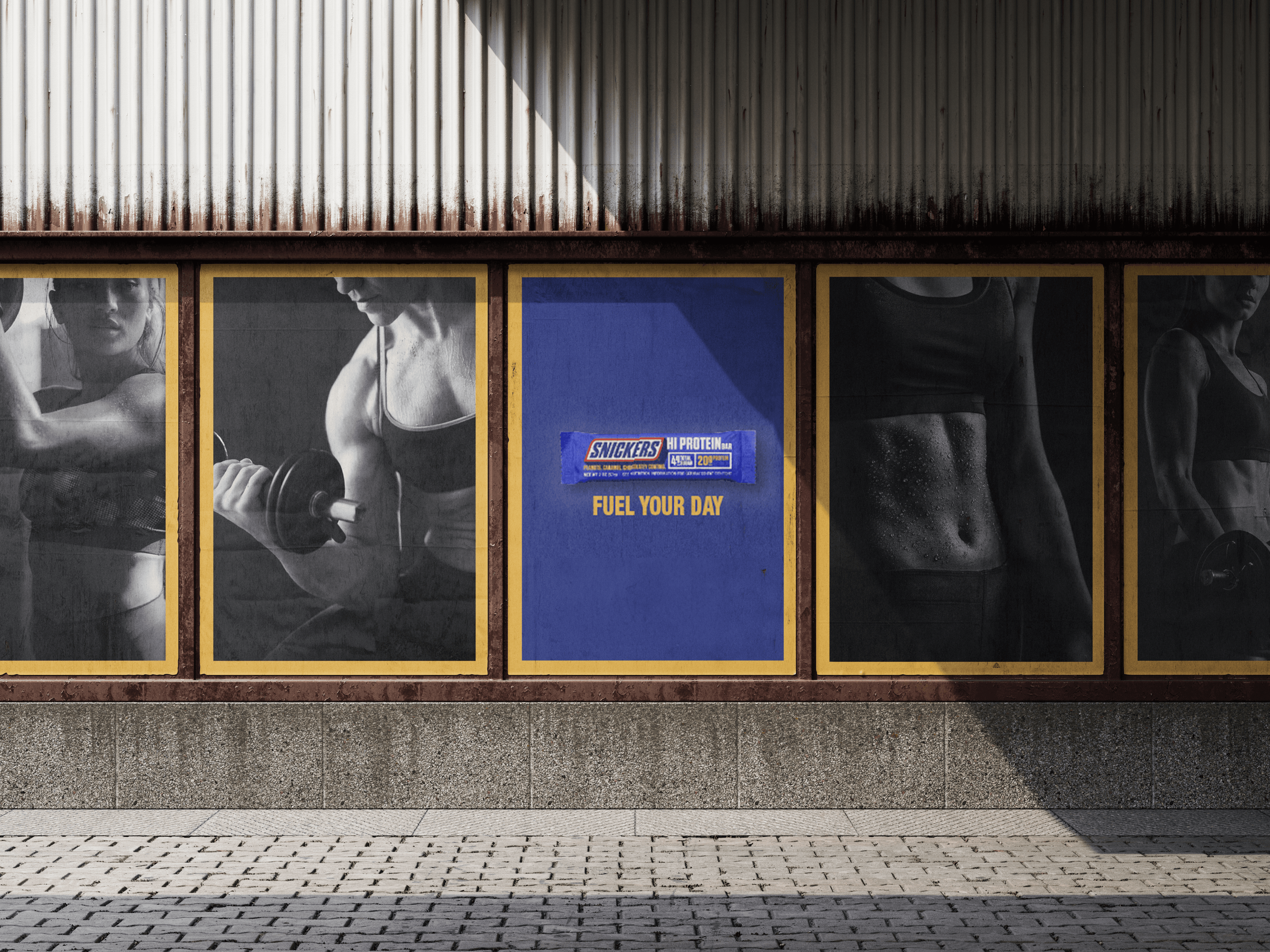
Breaking the "Candy Bar" Stigma Snickers is a household name, but it is synonymous with indulgence, sugar, and satisfying a craving, not fueling a workout. The launch of the Snickers Hi Protein bar presented a unique challenge: How do we convince health-conscious women, who usually shop in the health aisle, to trust a candy brand with their nutrition? The brief was to disrupt the market perception. We needed to retain the accessibility and recognition of the Snickers brand while visually pivoting to a "gym-ready" aesthetic that speaks directly to women who prioritize strength and fitness.
solution
"Athletic Chic" Meets Brand Heritage I designed a campaign centered on "High-Contrast Strength." To distance the product from the colorful, chaotic world of candy marketing, I utilized a sophisticated Black and White photography style featuring real women in intense workout scenarios. The Palette Strategy I retained the iconic Snickers DNA—Royal Blue, White, and Gold—but repurposed them. Instead of using them for "fun" graphics, I used the blue as a solid, information-heavy color block and the gold as a sharp border. This signals structure and discipline, key traits of the fitness lifestyle. Visual Hero The imagery focuses on power, not just slimness. By showing women lifting weights and sweating in high-contrast monochrome, the design validates the target audience's hard work. Data-First Hierarchy The design prioritizes the macros over the logo. The text "20G PROTEIN / 4G SUGAR" is the dominant typographic element, proving immediately that this is a functional tool, not a treat.
The core philosophy of this campaign is "Function over Flavor." While Snickers is known for taste, this campaign sells results. The design language borrows from high-end sports apparel branding rather than food packaging.
My strategy was to merge the grit of gym culture with the trust of the Snickers brand.
The Power Frame I developed a layout system defined by a distinct yellow border. This "frame" acts as a spotlight, focusing attention on the subject matter and creating a consistent visual thread across all media, from bus shelters to Instagram grids.
Monochromatic Motivation I chose black and white photography to depict the women. This removes the distraction of clothing colors and focuses entirely on form, focus, and intensity. It elevates the mood from "snack time" to "grind time."
The Blue Block To ensure the brand was unmistakable, I utilized a solid block of Snickers Royal Blue for all information. This high-contrast area houses the crucial data: "20G Protein, 4G Sugar". This design choice effectively communicates that while the vibe is new, the flavor is the Snickers you love.
year
2023
timeframe
16 days
tools
Adobe Creative Suite
category
Personal Project
01

02

03

see also


