TWIG (Campaign Design)
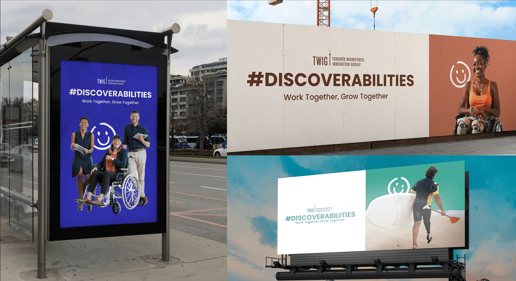
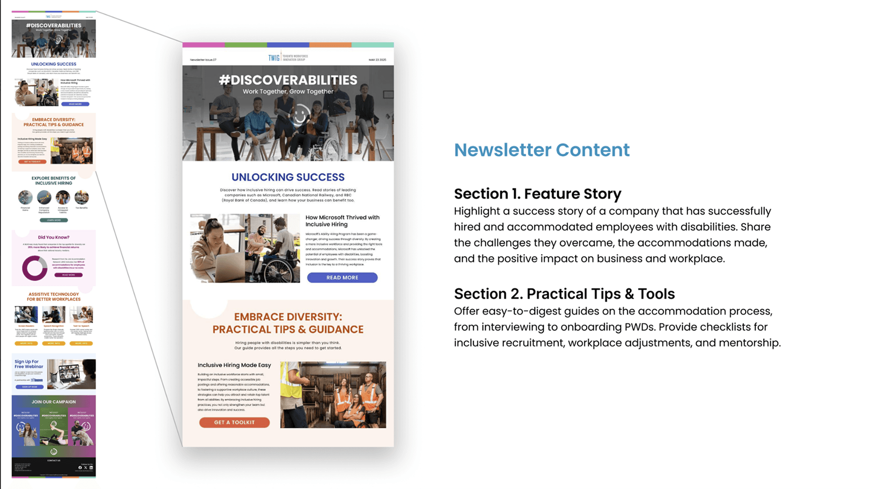
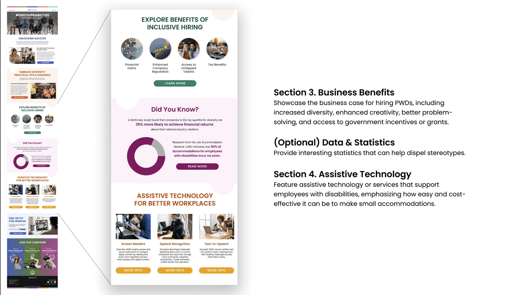
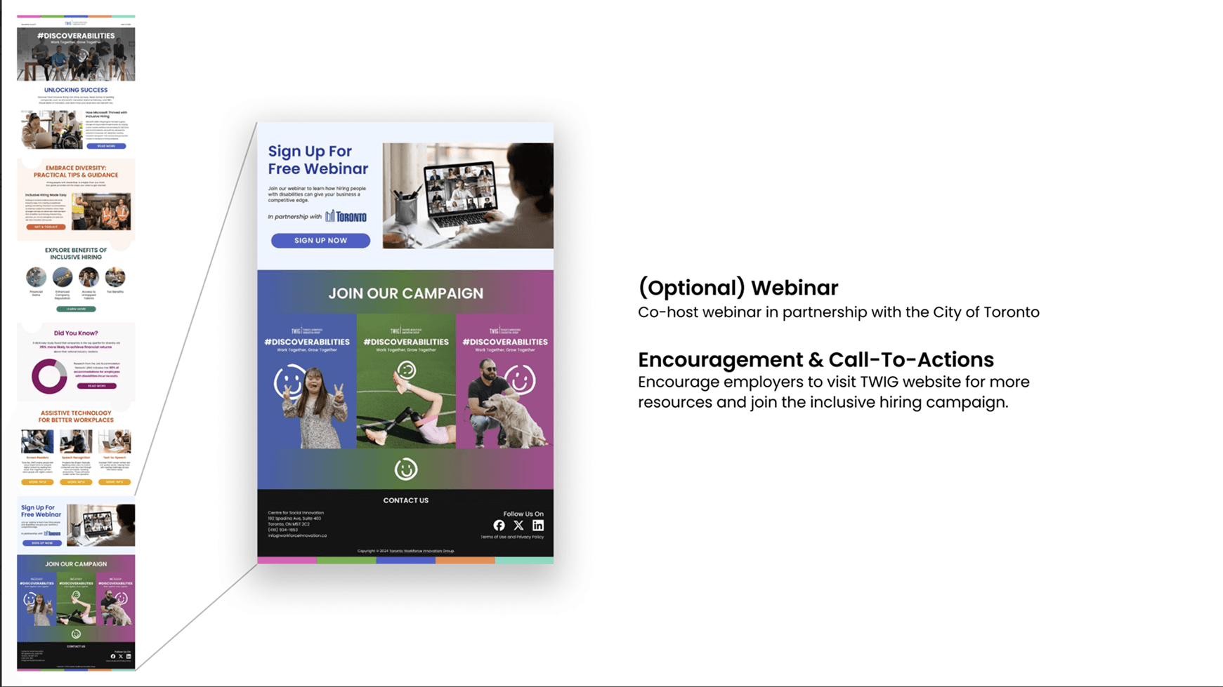
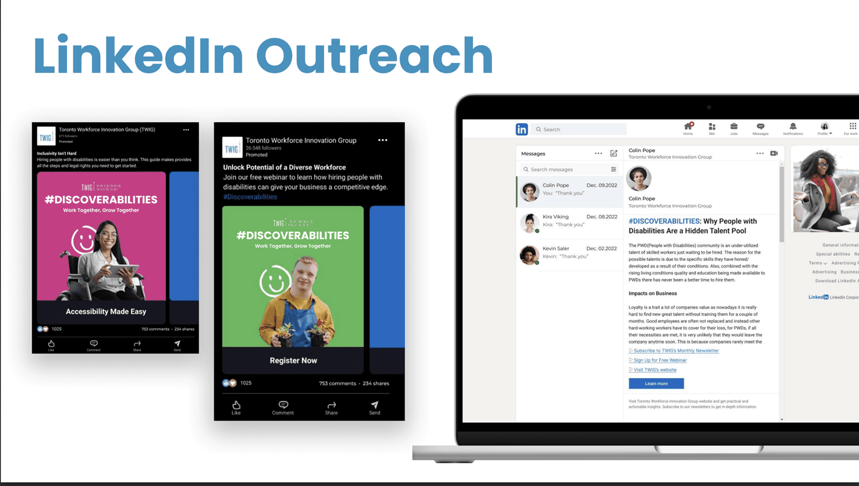
#DISCOVERABILITIES The philosophy behind this campaign is "Ability First." We wanted to visually prove that an inclusive workplace is a thriving workplace. The layout strategy utilizes a "Split-Screen" approach for Out-of-Home (OOH) media. One half is dedicated to the clean, bold typography of the hashtag #DISCOVERABILITIES, ensuring the message is legible at high speeds. The other half is dedicated entirely to the human subject, allowing their personality—not their disability—to take center stage. For the digital components, such as the newsletter and LinkedIn outreach, the design shifts to a modular "Card System". This organizes dense information (like "Practical Tips & Guidance" and "Tax Benefits") into digestible, colorful chunks. It respects the employer's time while providing the "Unlocking Success" toolkit they need to take the next step.
00

problem
Shifting the Narrative from "Obligation" to "Opportunity" The Toronto Workforce Innovation Group (TWIG) faced a significant communication barrier. Employers often view inclusive hiring (specifically hiring people with disabilities) through a lens of complexity, compliance, and cost. The existing visual landscape for this sector is typically clinical, somber, or overly reliant on "charity" tropes that evoke pity rather than professional respect. The brief was to dismantle these misconceptions. We needed to reframe disability in the workplace not as a challenge to be managed, but as an untapped talent pool to be discovered. The goal was to create a campaign that felt vibrant, human, and commercially viable, encouraging businesses to "Work Together, Grow Together".
solution
The "Joy of Ability" System I designed the #DISCOVERABILITIES campaign to look less like a government PSA and more like a lifestyle brand. The visual identity is anchored in Positivity and vibrancy. The "Smile" Icon I developed a simple, hand-drawn loop icon that forms a smiley face. This symbol acts as a disarming visual hook. It instantly lowers the "fear factor" associated with HR accommodations and replaces it with a universal signal of connection and happiness. Color Blocking Strategy To represent the spectrum of the workforce, I moved away from sterile corporate blues. Instead, I employed a diverse palette of Magenta, Leaf Green, Royal Blue, and Terracotta. This color-blocking technique allows the campaign to dominate visual space in subway stations and social feeds, signaling that diversity is bold, not quiet. Empowerment Photography The imagery was carefully curated to break stereotypes. Instead of passive shots, we featured subjects in moments of action and joy: a surfer with a prosthetic leg heading to the waves, a professional with a guide dog, and a confident woman in a wheelchair smiling directly at the viewer.
The philosophy behind this campaign is "Ability First." We wanted to visually prove that an inclusive workplace is a thriving workplace.
Why This Design Works for TWIG
1. The "Anti-Corporate" Iconography I used a hand-drawn style loop for the smiley face logo.
Why it works: Corporate HR campaigns can feel stiff and bureaucratic. The imperfect, organic line of the icon makes the brand feel accessible, grassroots, and human. It invites conversation rather than dictating policy.
2. Breaking the "Pity" Gaze The photography features a surfer and a laughing woman.
Why it works: It reframes the subject. By showing a person with a prosthetic leg engaging in a high-intensity sport like surfing, we subliminally communicate resilience, strength, and capability—traits every employer wants in a hire.
3. Categorical Color Coding I assigned specific colors to different campaign verticals (Pink, Green, Blue).
Why it works: It creates a "collectible" feel to the campaign. When seen side-by-side in a subway station, the variety of colors reinforces the core message of diversity. It prevents the campaign from blending into the gray background of the city.
4. Hashtag Typography The primary call to action is a hashtag, #DISCOVERABILITIES.
Why it works: It creates a digital bridge. The campaign is designed to move people from physical billboards to digital conversations. The bold sans-serif font ensures that the keyword is the most memorable element of the ad, driving search traffic.
year
2024
timeframe
30 days
tools
Adove Creative Suite
category
Branding and Identity
01
02
03
04
05

see also


